Alternate Print Problem
Solving issues with visualizing alternate colourways in Screen Printed Posters
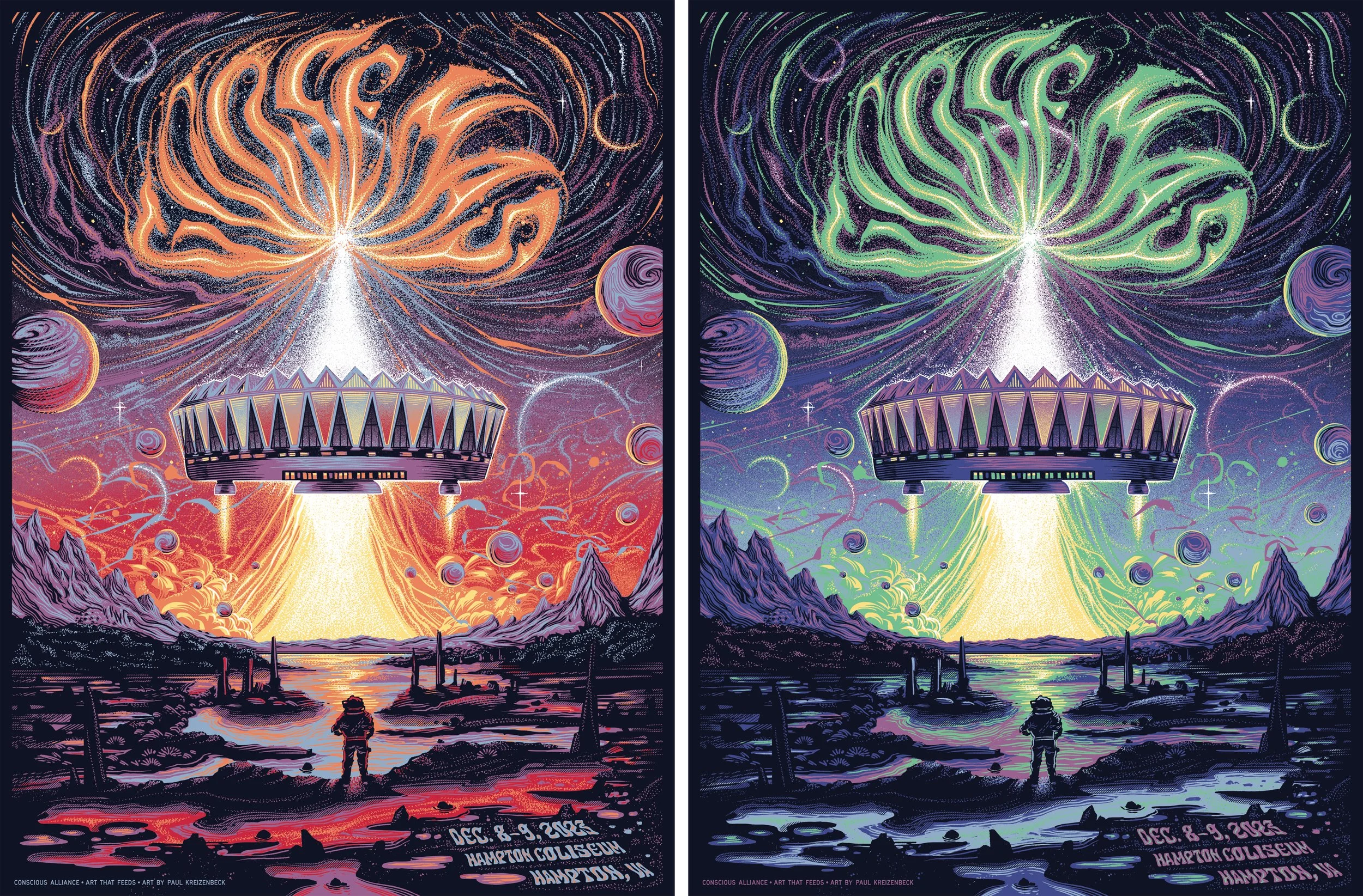
Art by Paul Kreizenbeck for Goose & Conscious Alliance, printed by RubySue Graphics.
Artists want more options for their alternate prints, but with more choices comes the chance for more confusion.
When screen printing posters, there are cost-effective ways to get two different prints out of the same screens if you do two setups where the printer changes the ink colour to create an “alternate” version. Many artists do this to create limited editions (Artist proofs or APs) they can sell on their own websites for more profit than they would see from the initial sale of the artwork to the band or management company.
When setting up jobs with alternate setups, I noticed that the press operators were having problems visualizing what the print should look like during each step of the process. This was causing wasted resources, affecting delivery times and the sanity of the staff.
PROBLEM STATEMENT:
"Press operators who are printing alternate setups struggle to visualize the variant print order, resulting in a loss of productivity, materials, and revenue."
Analyzing the problem
When we have the same job with different setups, we give each version its own letter to tell them apart. This can be because the artist is changing inks or papers between versions. If the paper is dark, or a mirrored foil, it needs a white base so the paper colour doesn’t tint the ink colour. Like if you had a wall that is painted black and you want to paint it yellow, it will need a thick coat of white primer underneath to keep that yellow bright and not affected by the black.
First Pass Ideas
My Initial thought was to screenshot each stage of my final separations and share the location on the local server for easy access.
This created more mental load for the operators, and after discussions, we decided on email attachments for each step, along with a written note of each screens stage in the process.
Refining the Solution
This worked ok, but not efficiently, and still caused confusion. Notes could get lost; they required sorting through the reference images, and it was taking too much time. The final approach that clarified everything was a spreadsheet breakdown of every screen, in order, showing the various setups side by side. This took an additional 15 minutes on my end when completing a job, but made everything much clearer for all stakeholders.
"OMG, yes,
This is perfect!"
-Press Operators’ comment
Getting it just right.
The result was minimal errors, a jump in productivity, and reduced lost revenue due to misprints and the cost of materials. This led to faster delivery times, customer retention, and a boost in morale when facing these types of jobs. It felt really good to alleviate the frustrations of my co-workers and help the bottom line of the company.