Gotta keep ‘em separated
Break it down to build it up.
NOTE: I did not create any of the artwork on this page; I produced the color separations for screen printing. It is copyrighted by the original owners.
What the heck are colour separations?!
The methods for Colour separations vary depending on the medium, but the principles remain the same. It is the process of breaking down an image, design, or artwork into individual colours that are burned onto separate screens for printing.
With ink and laser printers, you only get a mix of Cyan, Magenta, Yellow & Black ink to recreate an image. But with screen printing, the colours and blends are infinite. Metallic inks, Bright Neons, Glow-in-the-Dark, etc.
It’s my job to take the image and recreate it with “spot” colours; each colour gets its own screen, and the image is built back up on the medium. That can get costly if you’re not doing it yourself, so my task is to produce that print in the least amount of inks possible to save the customer money.
Poster Separations
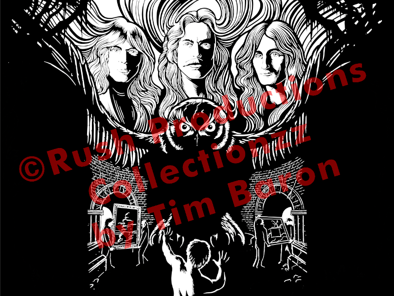
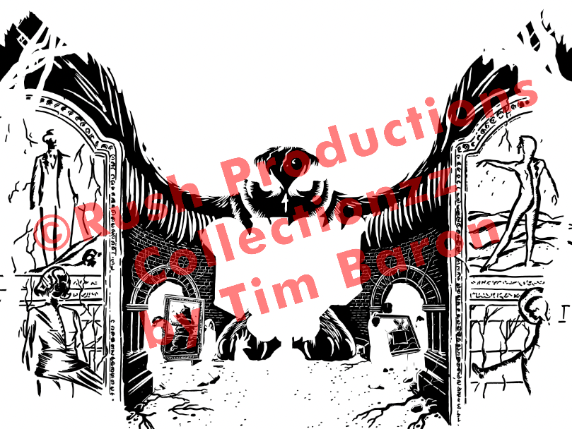
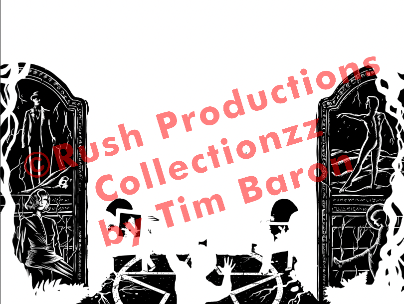
Flatstock, or screen printing on paper, requires “trapping” the colour-separated layers and keeping them in a particular order so they cooperate with each other and blend properly. This “trapping” is created by extending a small amount of the separated layer underneath the colours above it, where those colours meet in the image. That ensures that the paper colour does not peek through, in case there is any variation in the paper between printing each colour, like the registration being off by less than 2 Millimeters. Things like humidity or temperature can cause the paper to “breathe” or expand and contract by small amounts.
Normally, we print the colours lightest to darkest, but depending on the artist's knowledge of the screen printing process, the overprinting can be used to create other colours, and more shades can be produced by understanding how colours interact or by blending transparent inks.
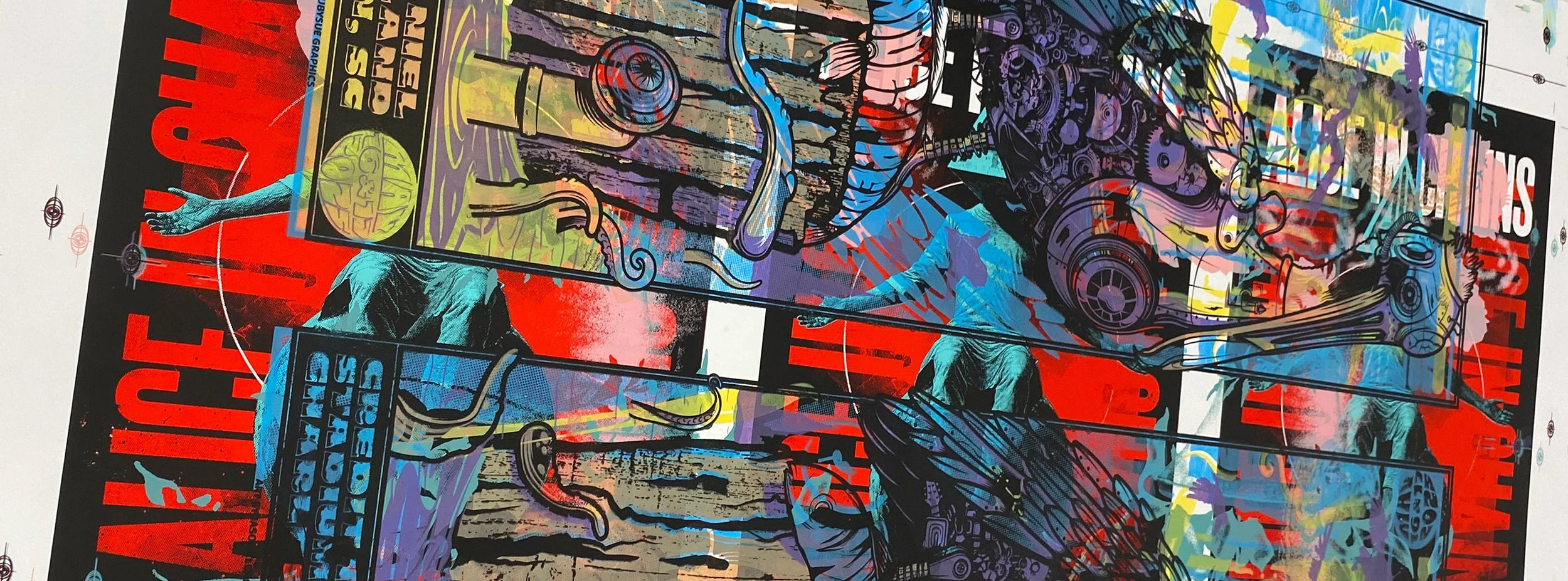
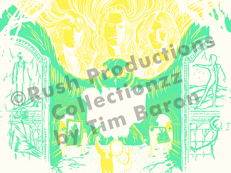
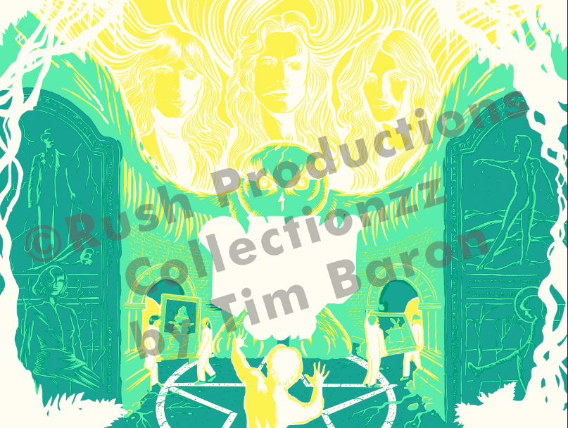
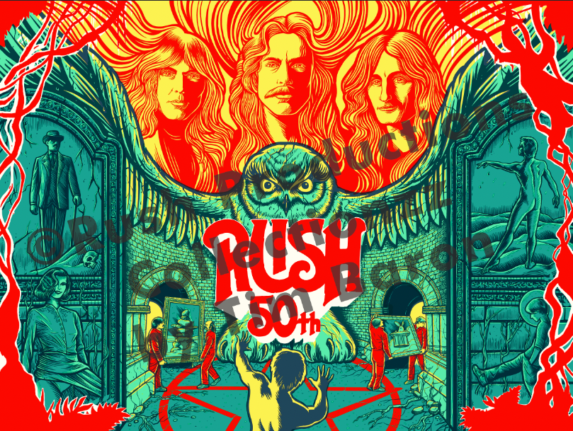
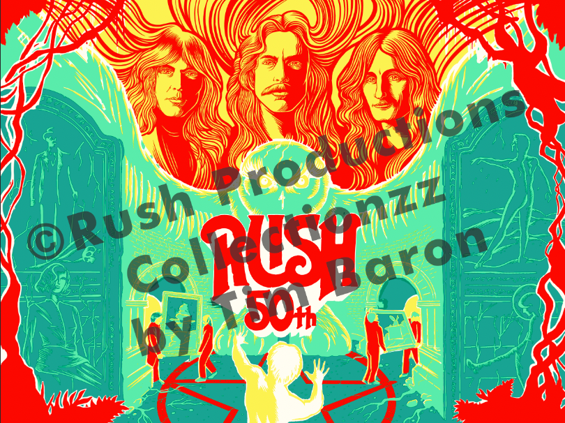
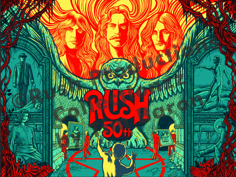
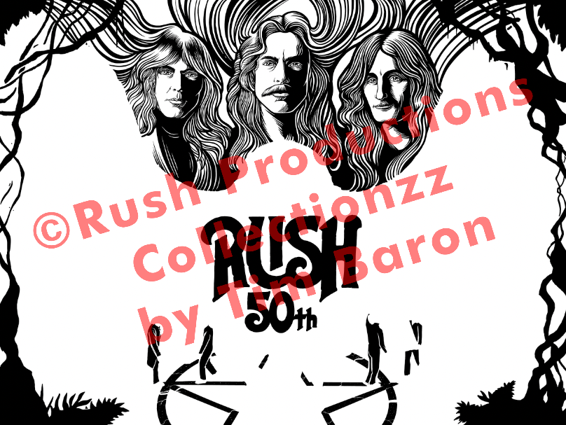
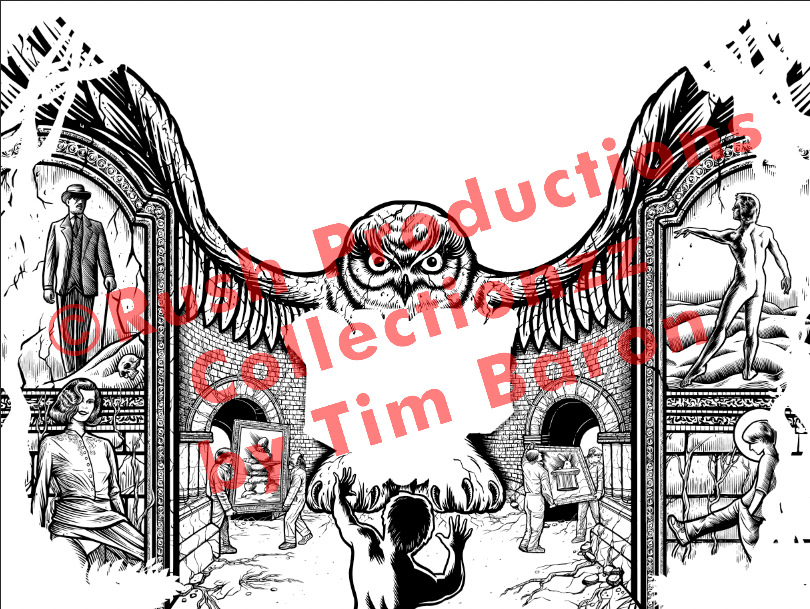
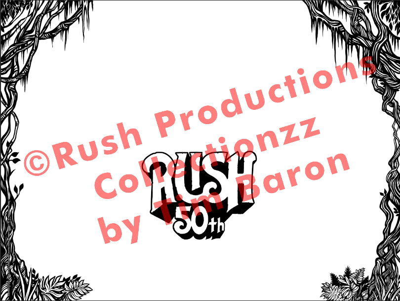
Rush 50th Anniversary
Artwork by Tim Baron, printed by RubySue Graphics for Collectionzz©Rush Productions
Working on this poster was truly a surreal experience. My friends and I listened to A LOT of Rush in high school, and this was one of the last posters I produced colour separations for in-house at RubySue before moving to Canada and working remotely.
In the weeks leading up to this job, I had the song “Fly By Night” stuck in my head while packing up my home and preparing to move my family across the continent to Vancouver, British Columbia. So when the folder came across my desk, I saw it as a beautiful send-off to the next chapter in my life.
The preparation came fairly easily thanks to the excellent file provided by Tim Baron. The red needed to be re-ordered and the underlying colours trimmed out, creating a white base so the yellow paper would not tint the inks, and re-trapping the layers so they would print properly in the correct order and not be affected by the shades of the other colours.
I felt an immense sense of obligation to make this poster print perfectly every time. It makes me so happy that it can now be enjoyed by others who appreciate the band as much as I do.
Dead & Co. - Boulder, Colorado, 2023
Art by JT Lucchesi for Merch Traffic, printed by RubySue Graphics
As someone who grew up listening to the Grateful Dead with my father, it was a great honor to help with the production of this poster. I was given a completely flat image, which is the hardest to start with.
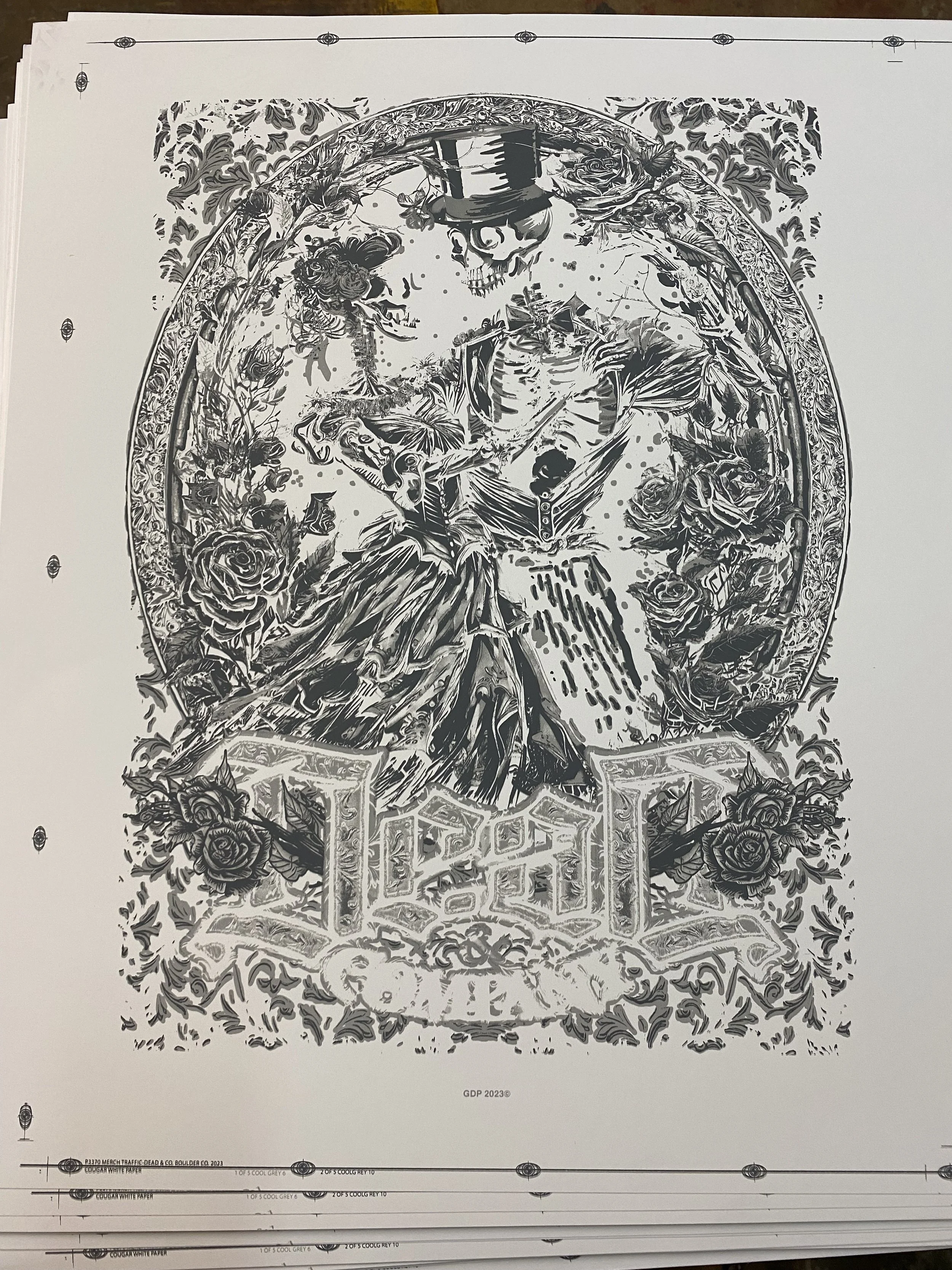
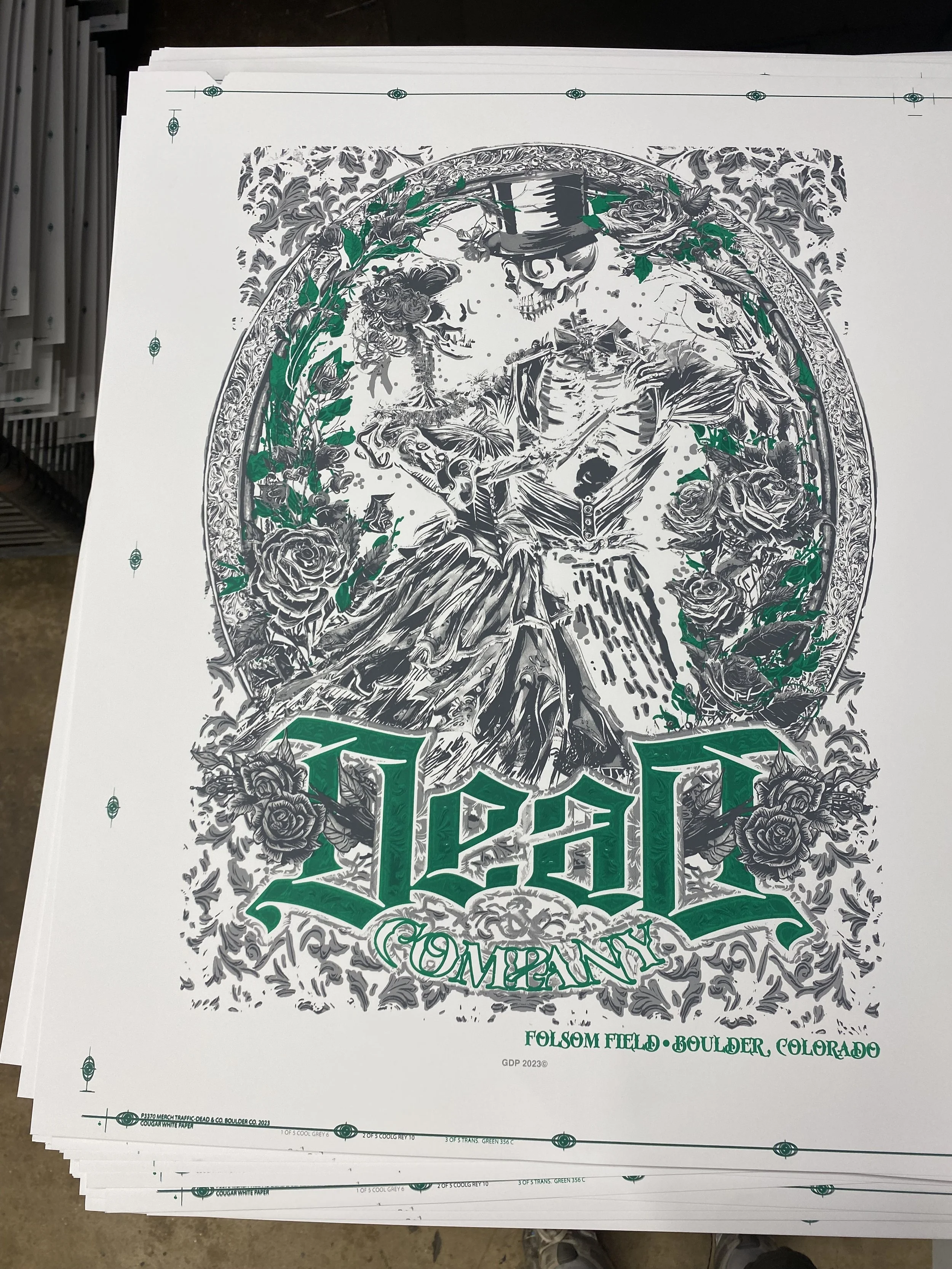
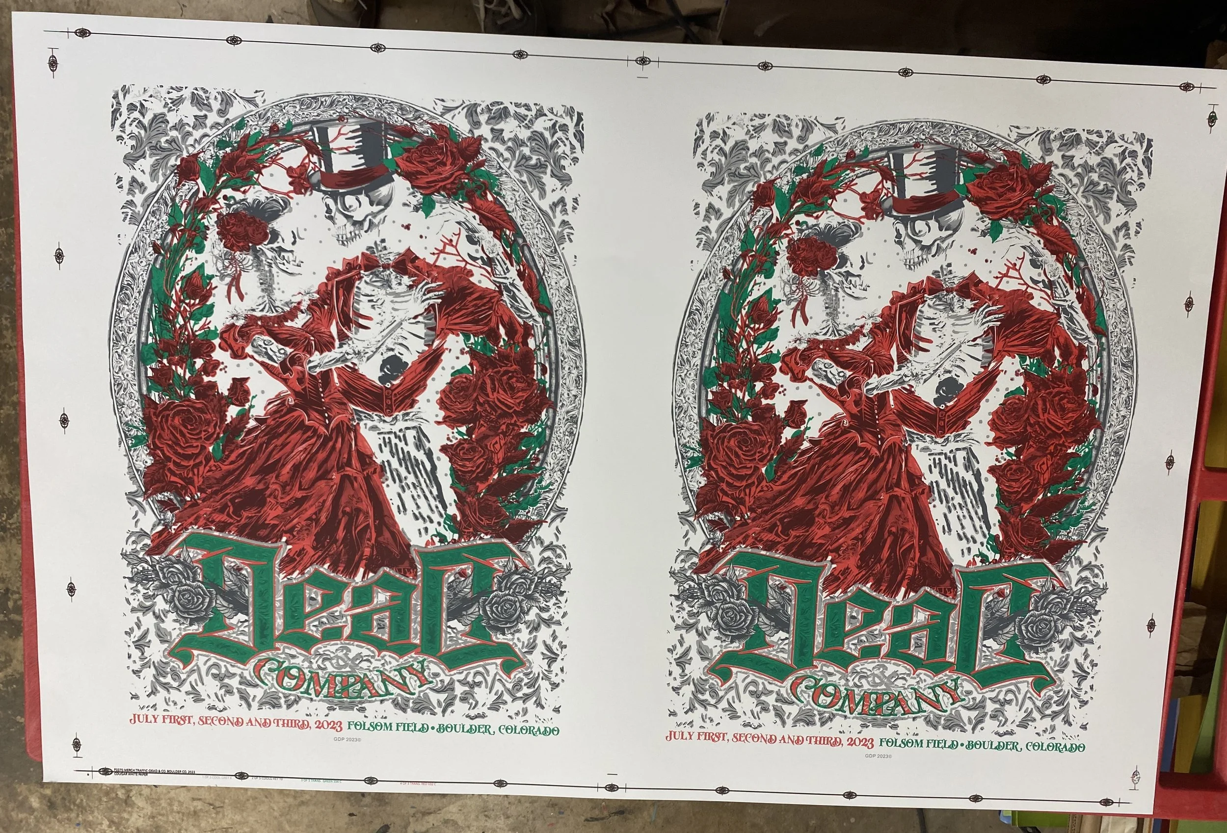
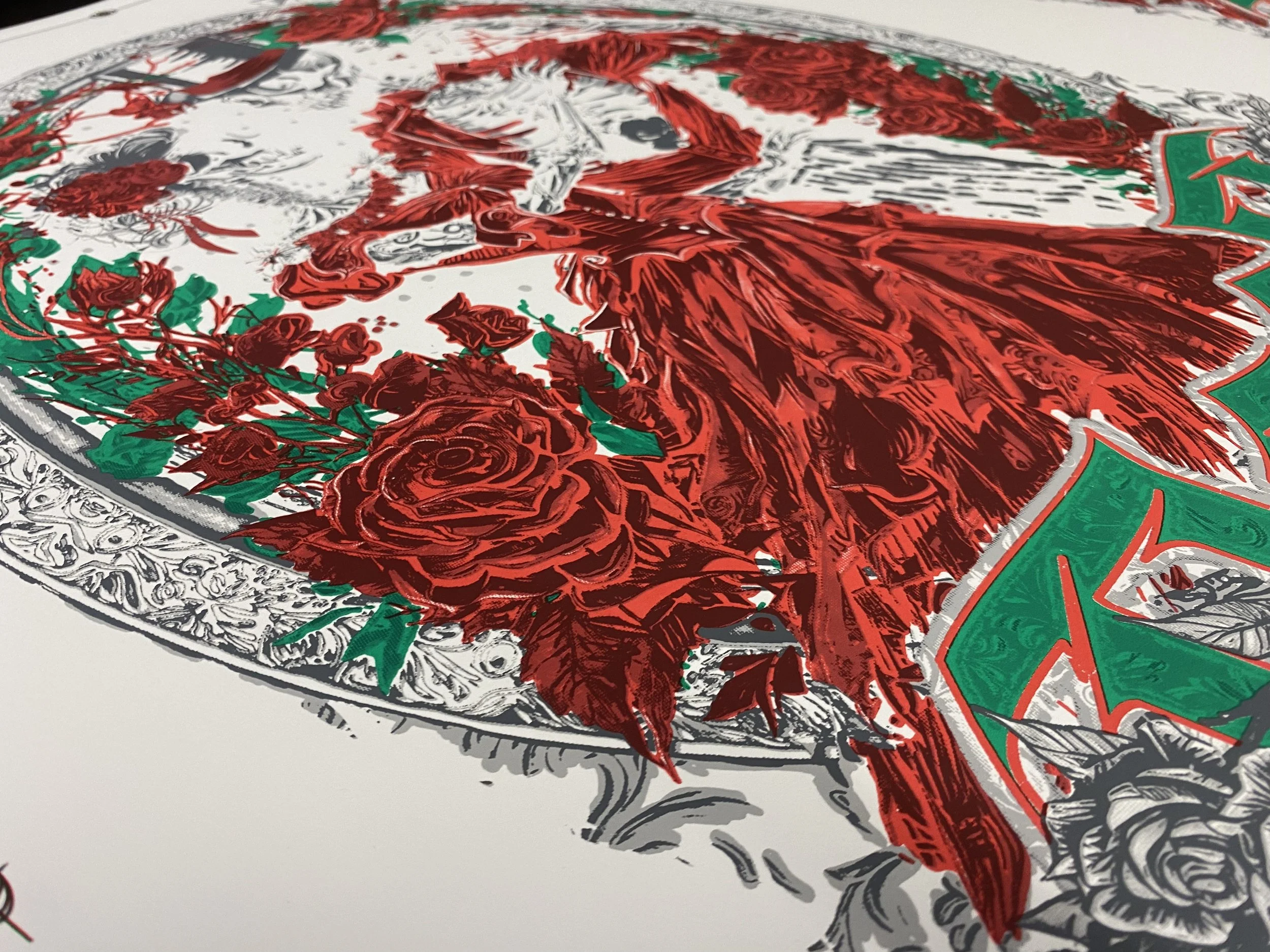
My approach began with treating the image as a greyscale colour profile and adjusting the levels to remove all mention of red or green. With just the shades of grey to work from, I was able to create most of the shading in two screens and add the colour printing on top of that with transparent inks. That would let the grey inks underneath create all of the shading on the green and red of the print.
It was a huge learning experience, and I felt a great sense of pride helping produce a high-quality print that made my father (and the Dead & Co. fans) happy.
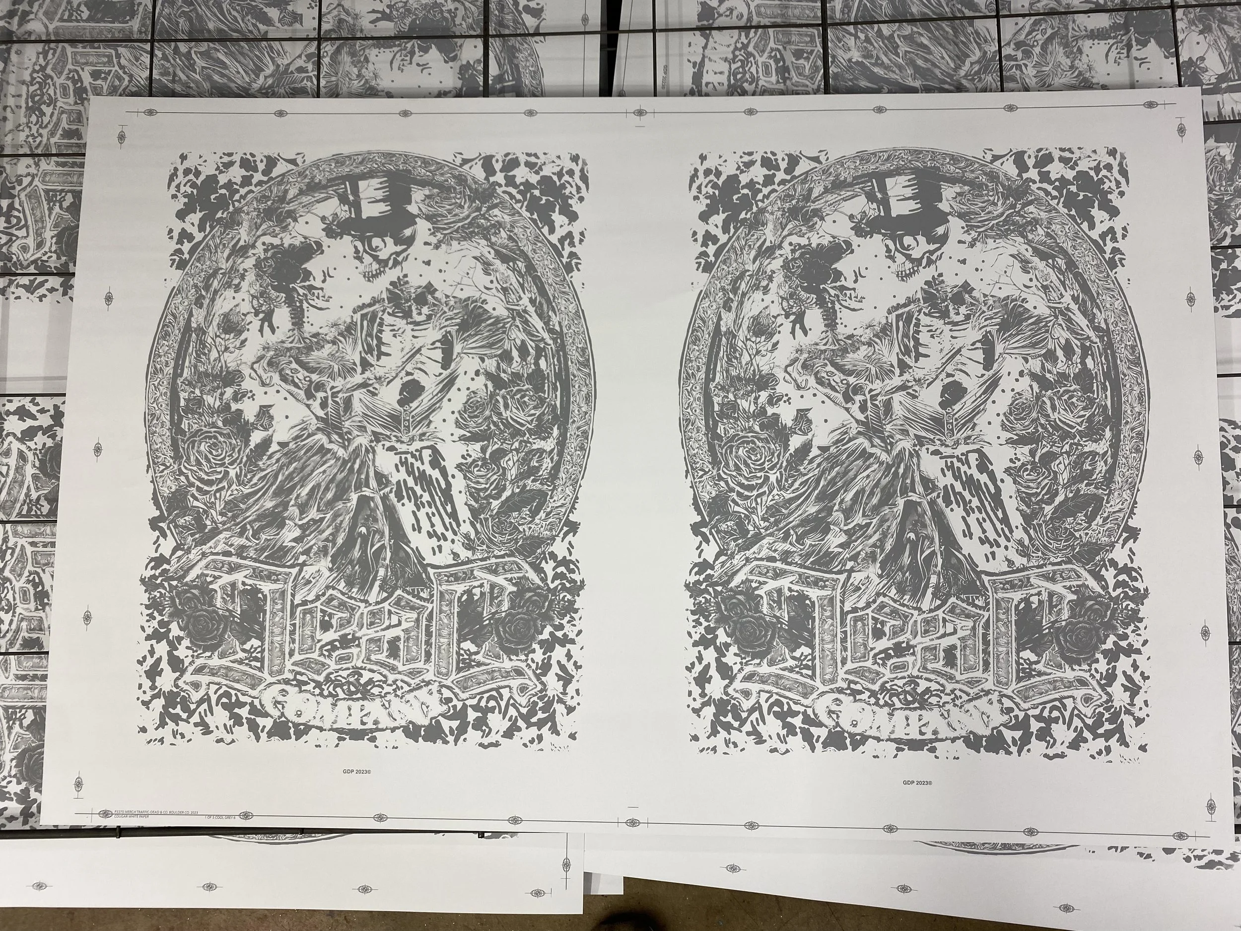
Screen #1: Grey
Screen #2: Dark Grey
Screen #3: Transparent Green
Screen #4: Transparent Red
Close up of Transparent Red
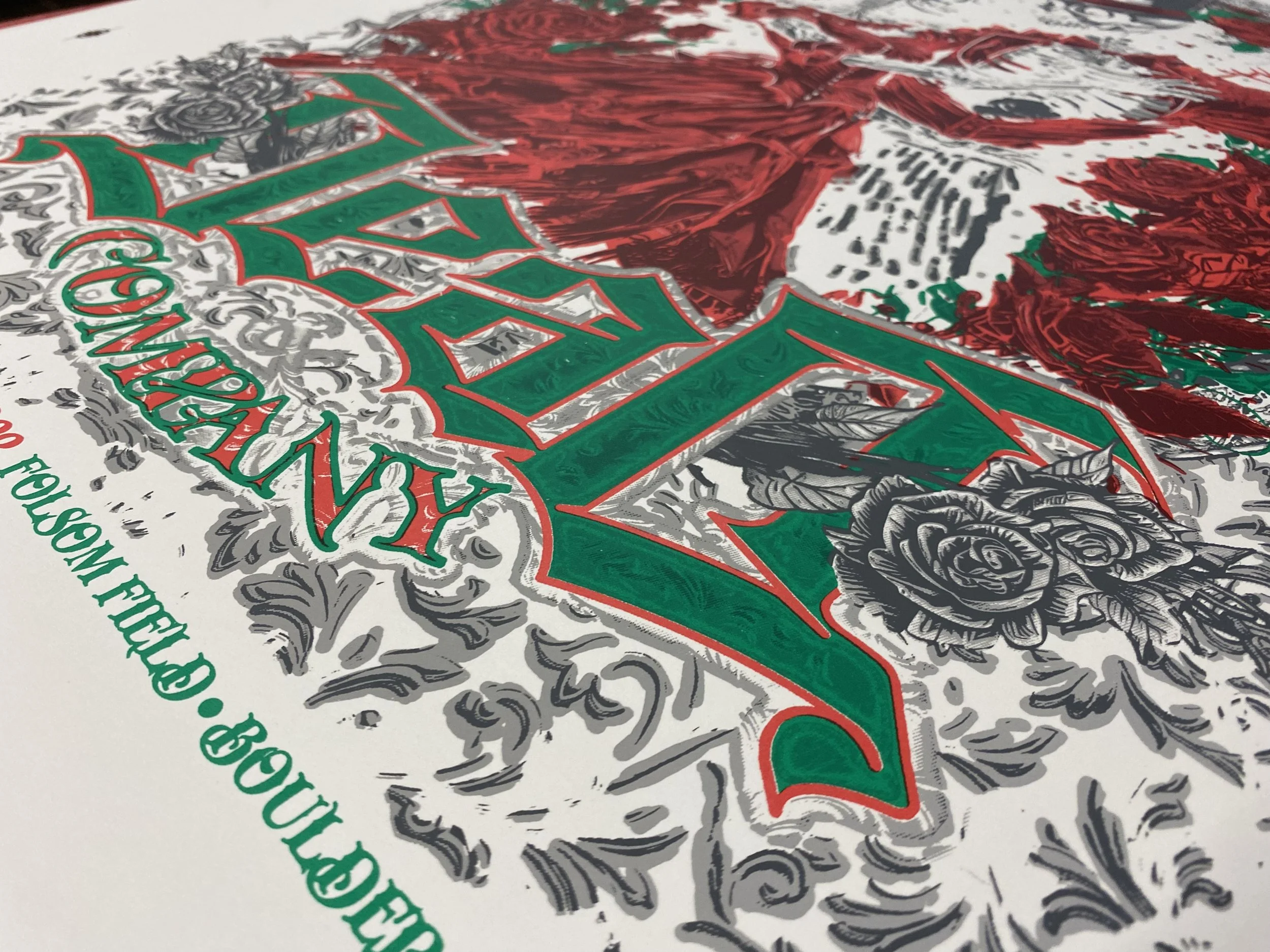
Closeup of Transparent Green
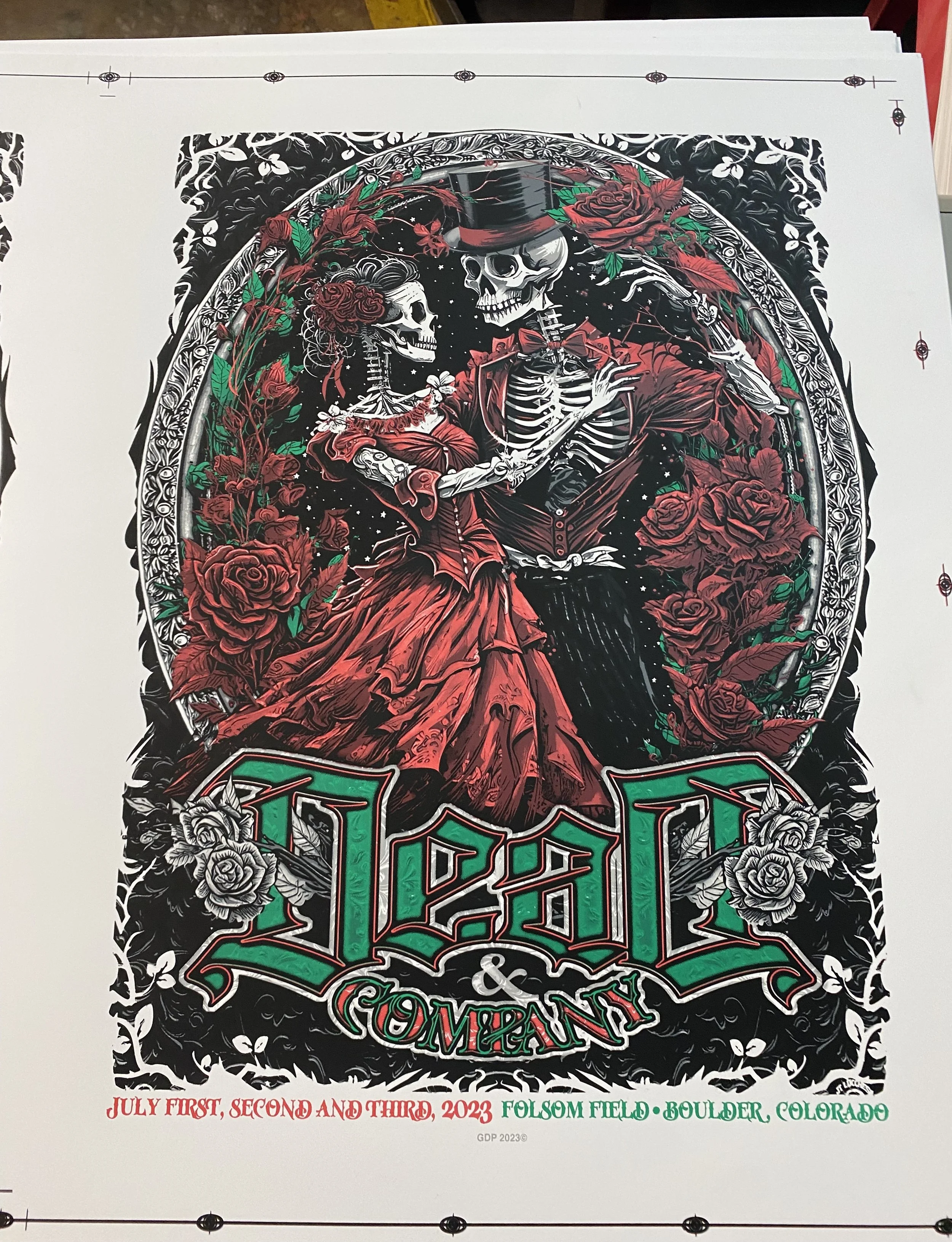
Screen #5: Black ink
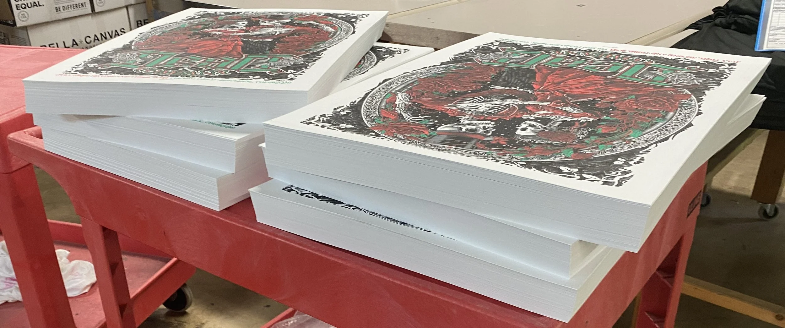
Cut posters, Ready for Packaging
T-shirt & apparel Separations
How and why are these any different than paper?
Colour separations for apparel need to be treated differently because different inks are used (usually with higher viscosity), and the fabric reacts differently from paper.
Instead of trapping the layers as I would for poster prints, apparel prints fit together more like puzzle pieces. You want to minimize overprint to reduce the buildup of inks, which creates a thick and uncomfortable garment.
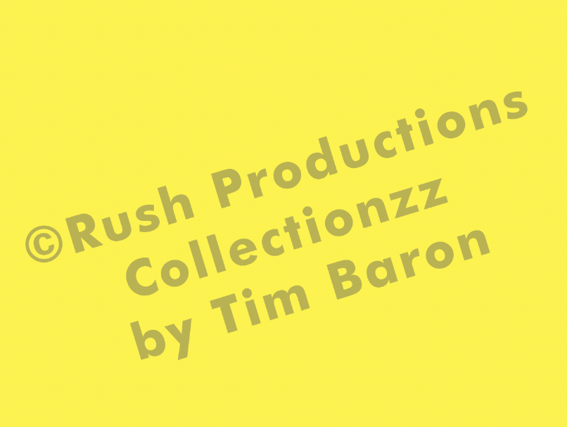
All of the normal rules of the process hold true; if the ink is darker than the medium, the vibrancy of the colour benefits from having a white base underneath. That can be used to your advantage to get more shades out of a single colour by utilizing halftone dots in the base to let some of that darker garment come through and tint the inks to create more values.
Bit Brigade
My favorite video game band and one of my top 10 NES titles (and cartoon?!) in one job- what are the chances?! The supplied art was phenomenal and made this job refreshing compared to the everyday customer files. The size was true to scale, the resolution was perfect, and it came with the type on separate layers!
I was able to get this beautiful image down to 10 colours (with a white base), with two stations to cure the ink. It provided a challenge getting it down to those screens, but the production team at RubySue had everything dialed in, and it printed perfectly every time.